When designing signage for healthcare environments, functionality is only part of the equation.
Medical centers require clear navigation, consistent communication, and a visual language that works naturally with the surrounding space.
This balance between wayfinding and design was at the center of one of our recent projects.
That is why we selected it as our Project of the Month.
The project took place in a cancer care center and included signage across three floors.
An interior designer developed the interior space in collaboration with the project team.
She defined a clear architectural and visual language for the project.
From the beginning, the goal was not simply to install signs.
The team aimed to create a signage system that supported navigation and respected the design concept.
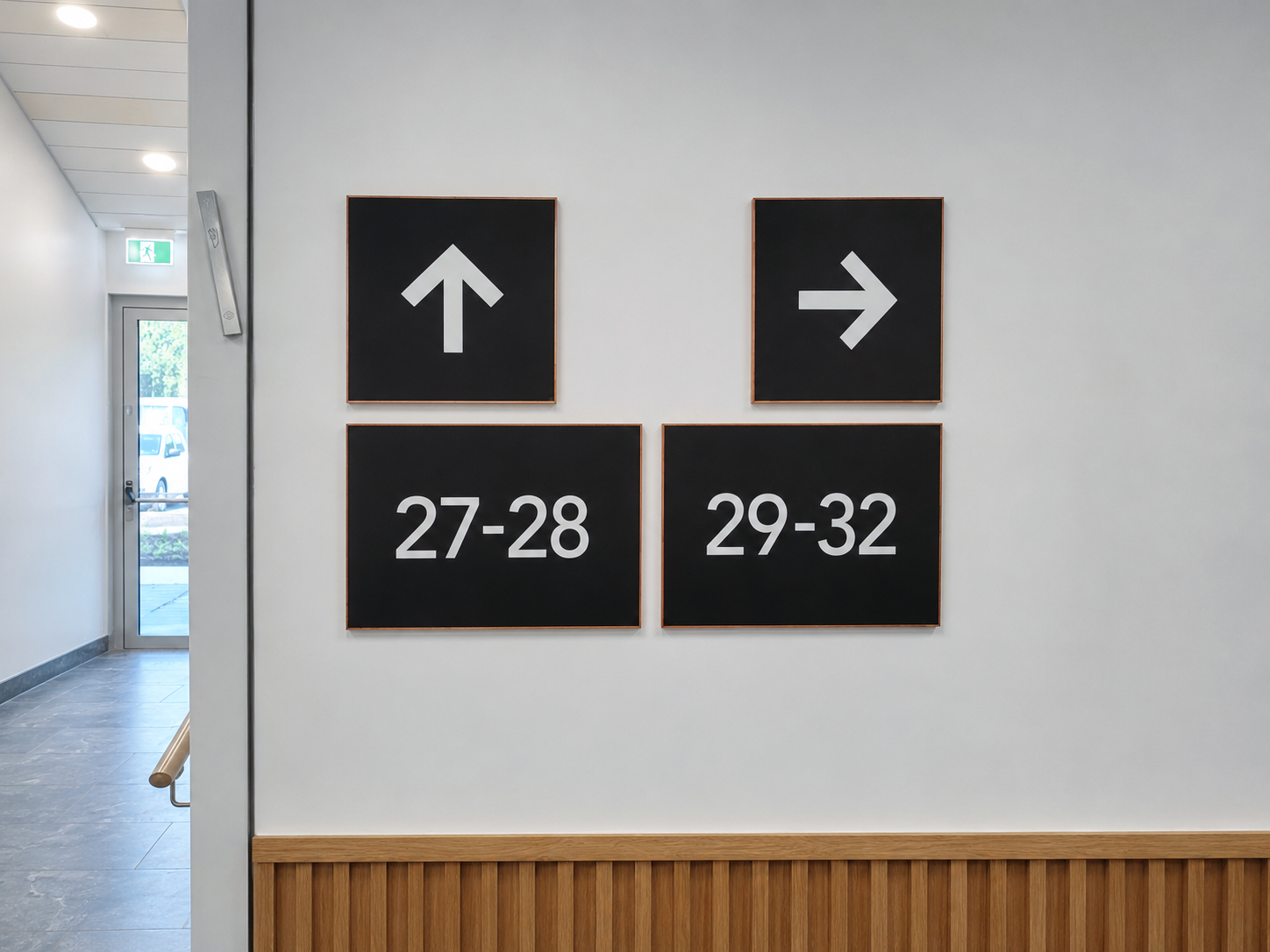
To achieve this goal, the project team selected slim Vista Sharp frames.
The project team used a 4-profile construction.
This created a clean, precise, and elegant look.
Vista Sharp is known for its refined appearance.
Rather than drawing attention to the frame itself, the system allows the information to remain the focus.
One of the most important aspects of this project was consistency.
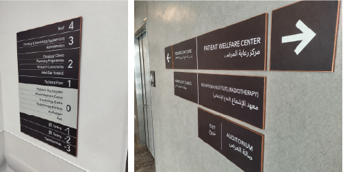
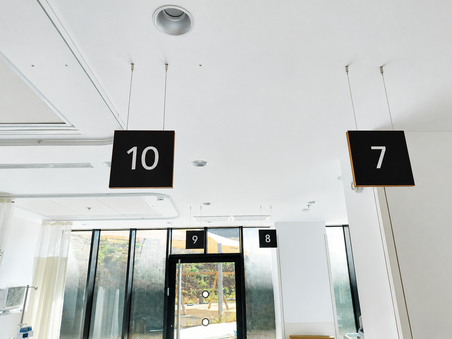
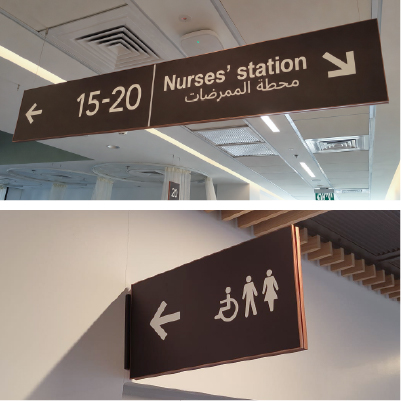
The signage appeared throughout three different floors and included several sign types.
These included directories, room identification signs, and wayfinding signs.
Although the formats varied, every sign followed the same visual language.
As a result, visitors and staff experienced a clear and organized environment.
Healthcare spaces often create unique signage challenges.
Visitors may feel stressed or unfamiliar with the building.
Therefore, navigation must remain simple and intuitive.
At the same time, medical spaces also require a calm and professional design.
This project shows how both needs can work together successfully.
Another important feature was customization.
The Sharp frames were painted according to the project specifications.
This allowed the signage to match the interior designer’s vision.
It also helped the signs blend naturally into the space.
Each sign supported the design concept and stayed clear and easy to read.
The project also included magnetic panels.
This created a flexible and practical signage solution.
Information can be updated when needed without replacing the full sign.
For medical centers, this is a major advantage.
Departments may change, rooms may move, and information may need updates.
Magnetic panels help keep the system clean, flexible, and easy to maintain.
Moreover, the project highlights an important idea in modern signage design.
Some signs are made to stand out.
Others are made to work perfectly with the space.
In this project, the signage did both.
The information remained visible and clear.
At the same time, the system behind it blended naturally into the design.
This is where Vista Sharp becomes especially effective.
Its slim profile creates a sophisticated appearance.
Its modular structure supports different sign formats.
In addition, its adaptability allows designers to meet specific project requirements.
This makes it a strong choice for healthcare, office, and architectural signage projects.
The project delivered an organized, refined, and fully integrated signage system.
It created order across all three floors.
It also supported the design language chosen for the medical center.
Most importantly, it helped visitors navigate the building with greater confidence.
This project is a strong example of how signage can support architecture.
When signs, interiors, and wayfinding work together, the result feels complete.
The space becomes easier to understand.
It also feels more professional, calm, and welcoming.
If you are planning a new signage project, our team can help you choose the right solution.
Leave your details here, and we will be happy to support your next project.